
Custom “LA” graphic
Overview
APPLE
E-Commerce UX/UI
E-Commerce Conversion Optimization
SR. UI DESIGNER
Deloitte Digital x Apple
2023
CHALLENGE
In regions across Latin America, the Middle East, Asia, and Europe lacking direct Apple retail, Apple Premium Partners drive significant revenue by serving local markets. However, inconsistent reseller web experiences and inefficient product asset distribution during major launches compromised brand quality and conversion. We acted as liaison between Apple HQ and pilot APP stores in South America and Europe to design an experience that would serve all parties.
SOLUTION
We architected a unified, UX-optimized Shopify e-commerce system that streamlined Apple HQ asset delivery, aligned global brand compliance, and boosted online partner sales.

GLOBAL ASSET DISTRIBUTION
By architecting a centralized framework linked directly to a master Digital Asset Management (DAM) system, Apple HQ can now deploy synchronized launch kits—including high-resolution hero imagery, localization files, and structured product specs—to every global partner simultaneously with a single push. This eliminated fragmented asset distribution and regional launch delays, ensuring day-one global brand consistency and zero operational lag across thousands of independent storefronts.
Shopify STRENGTHS AND LIMITATIONS
While we were able to leverage Apple.com’s high-converting UX principles, we had to adapt to Shopify’s technical constraints. Additionally, our strategy shifted focus from pure brand aspiration to price-conscious conversion—designing universal, customizable templates and components that highlighted value, financing, and local promotions without sacrificing brand quality.

Design CONVERGENCE
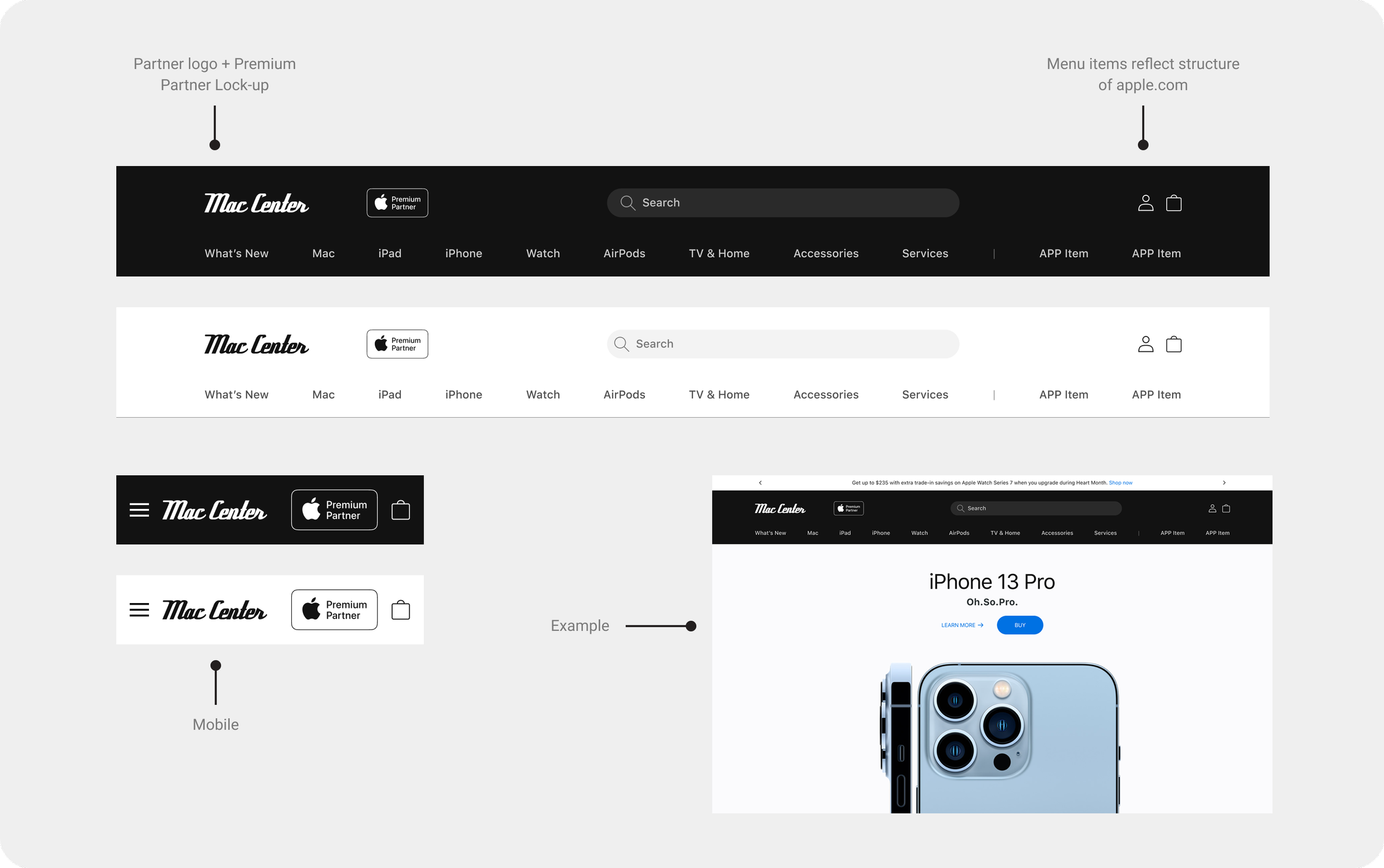
A consistent partner and apple logo lock-up was created to drive consistency as well as a navigational menu that mimicked the structure of apple.com
ADJUSTMENTS TO A MORE PRICE-CENTRIC USER
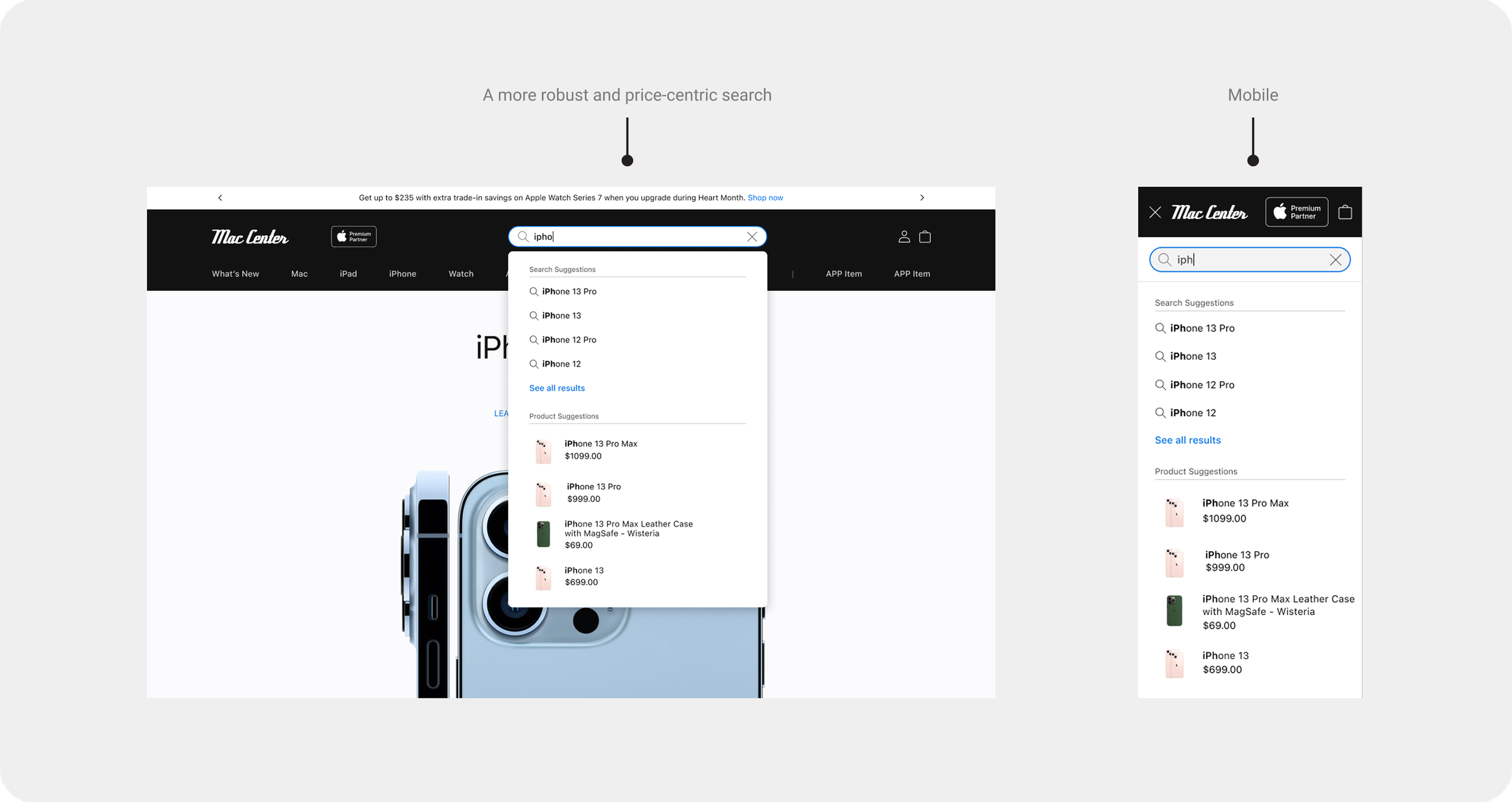
Unlike apple.com, pricing display is more forward even in details such as a search dropdown.
LINE-OF-BUSINESS STRIP
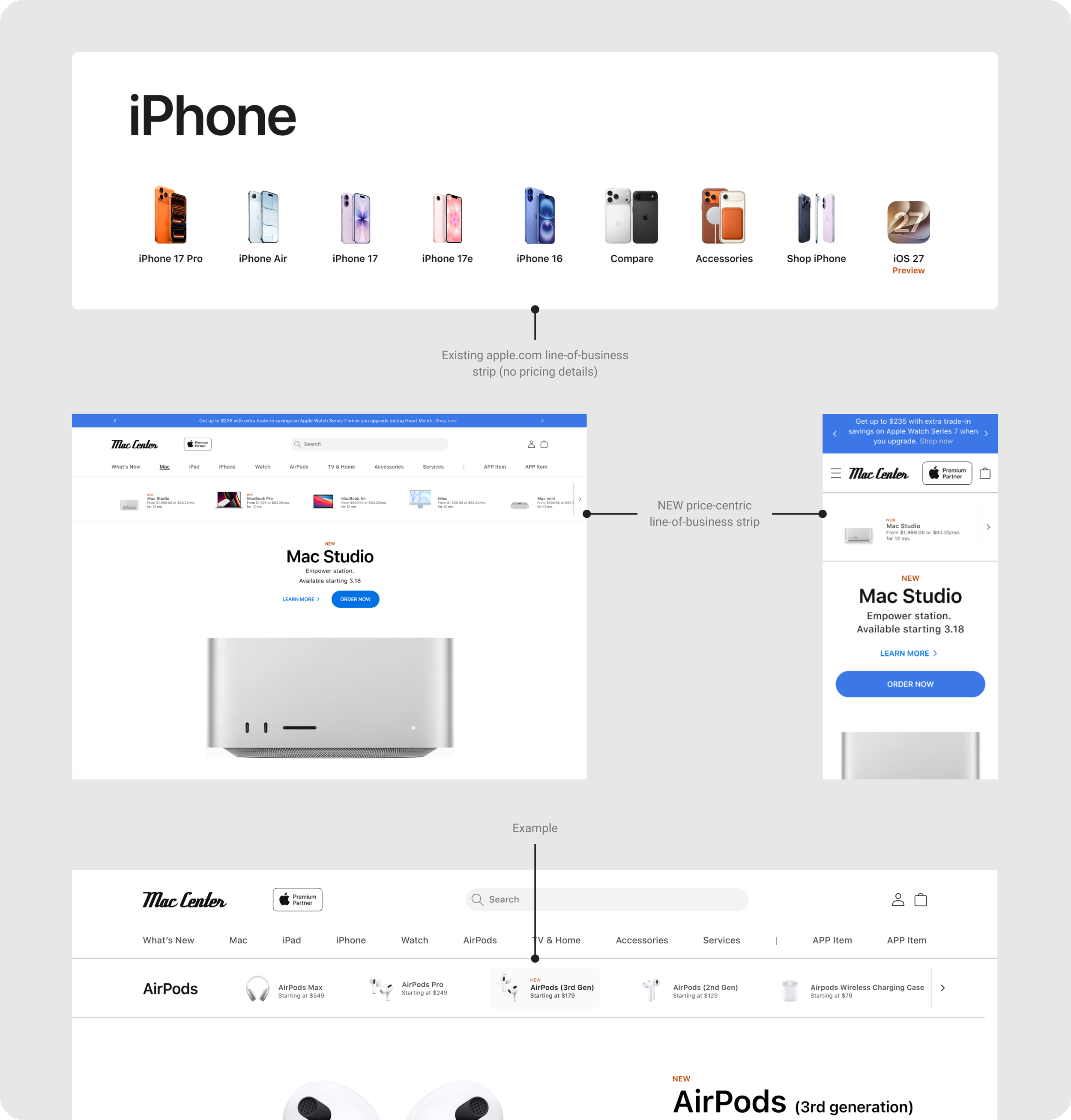
Although the line-of-business strip exists on apple.com, for the partner websites, we re-formatted it to include pricing and more direct product navigation.
PRODUCT DETAIL PAGE
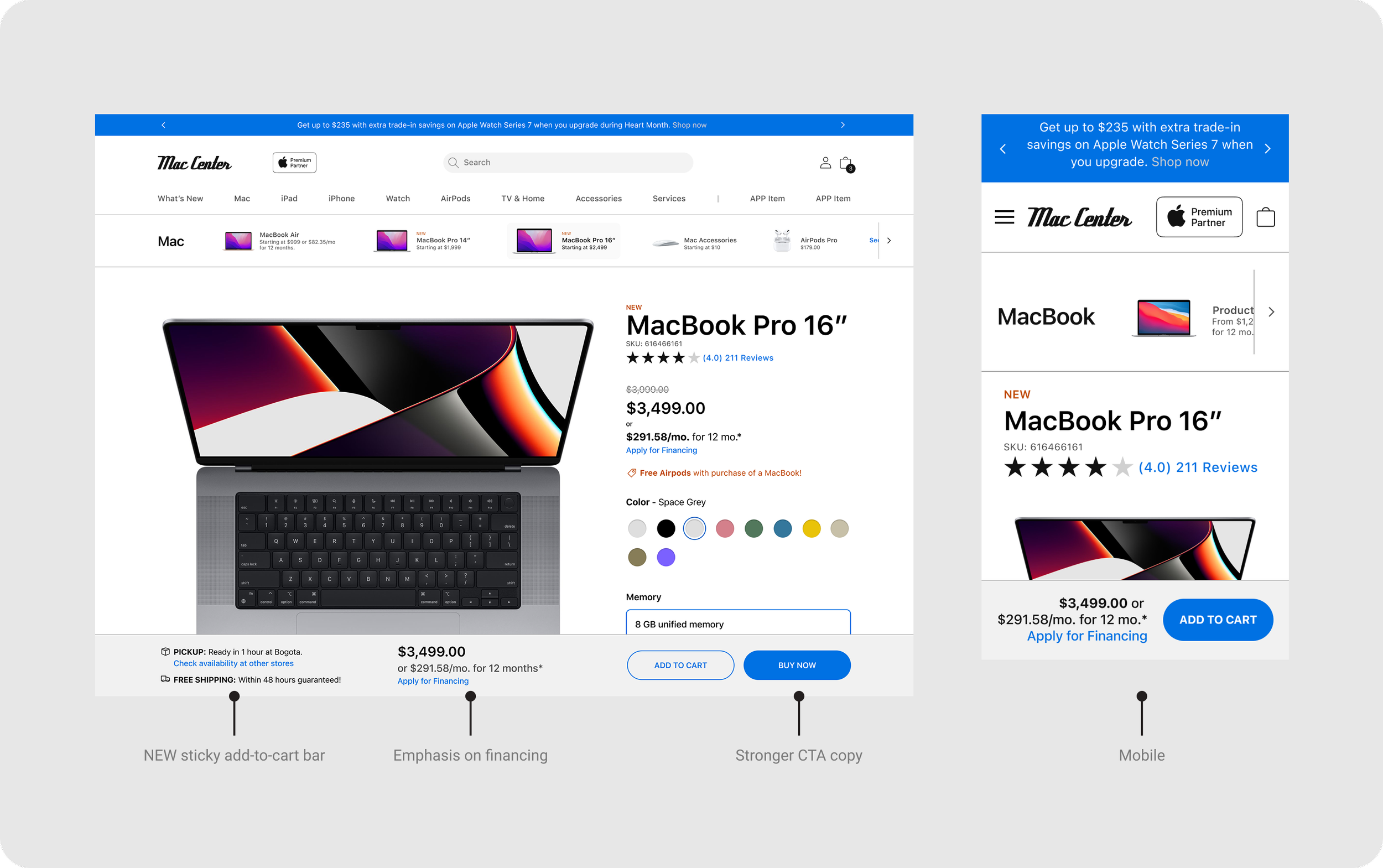
Although we leveraged much of the UX research from apple.com, we also made adjustments within the limitations of Shopify while also recognizing the specific needs of the specific user.
HITTING KPIs THROUGH UI
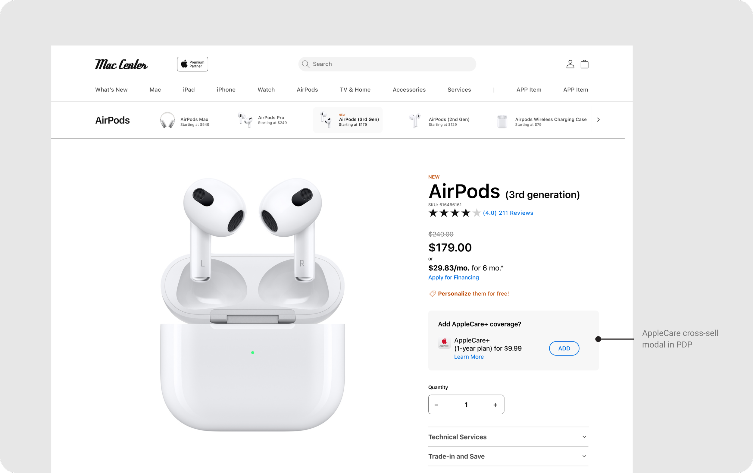
Upselling and cross-selling was an aspect many Partner websites lacked previously.
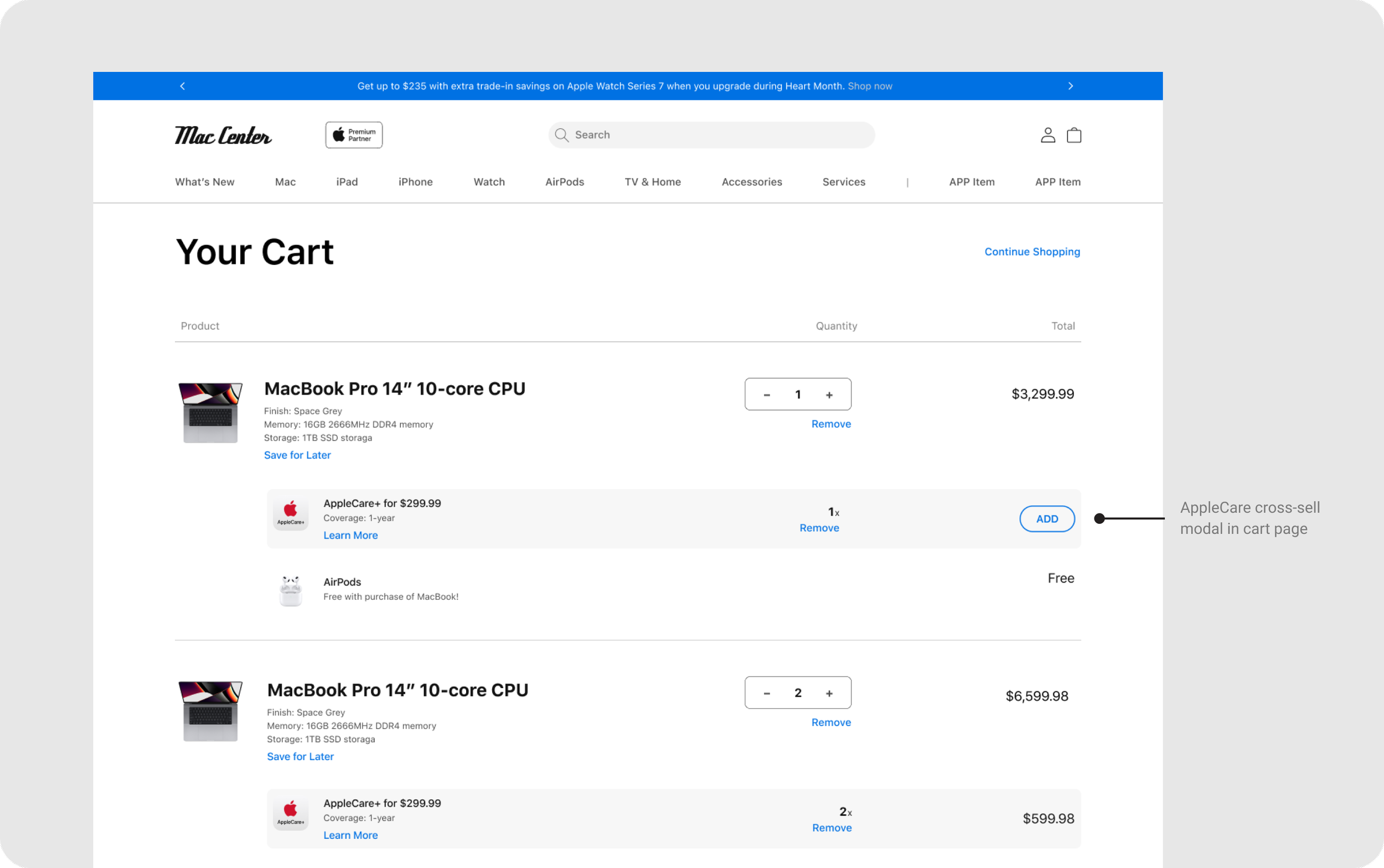
A more robust cart page offered more opportunity.
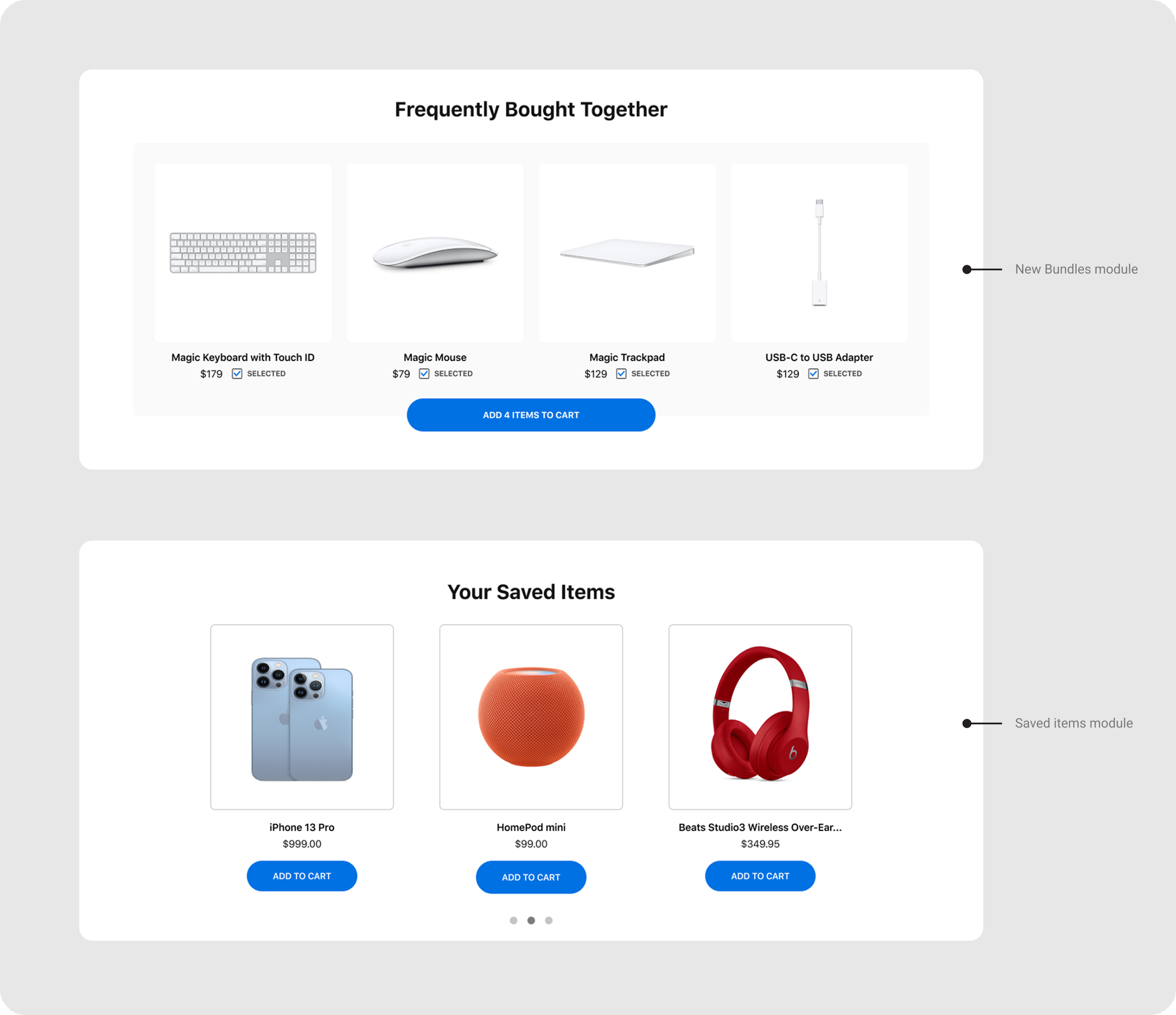
Supported by research from Apple HQ, bundles and saved items were key to increasing sales, features which Partner websites often lacked, helping both Apple corporate and local retailers.
SUPPORTED BY APPLE GLOBAL BUT WITH ENOUGH FLEXIBILITY FOR LOCAL
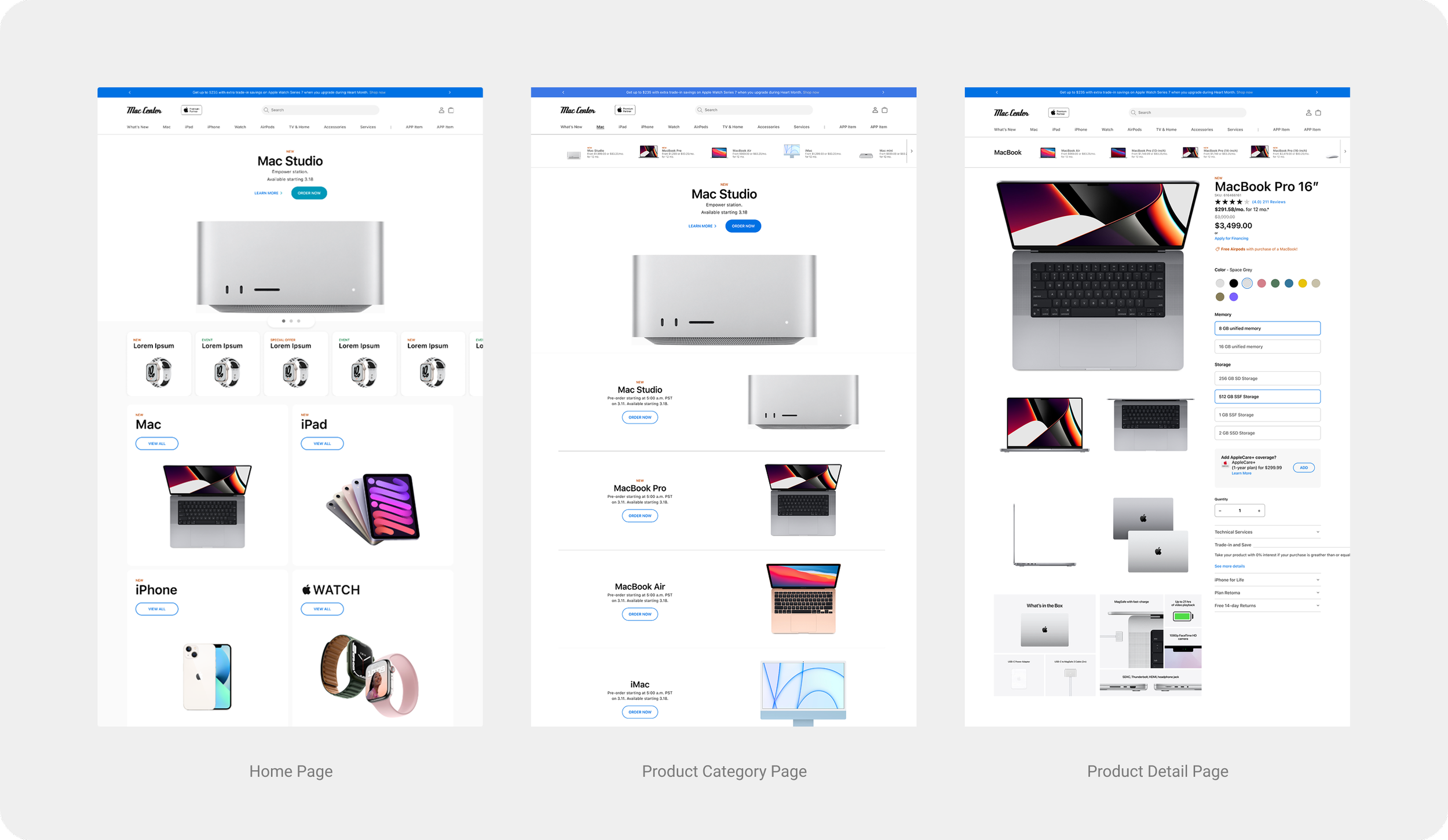
While designed to streamline process for partners and leverage Apple’s UX research to drive local sales, the platform retained enough flexibility for individual stores to tailor content and feature regional promotions.
Results

This incredible increase in sales may seem unbelievable, but I was assured by a project manager that it was true. Of course, this data was only one month after launch, and the exact reasons were yet unknown, key stakeholders at Apple HQ and the participating Apple Partner stores contributed much of it to our efforts.