Overview
Udemy
Brand Systems
Display Ad Systems
Automated Ad Systems
Social Media
360° Campaigns
Senior Visual Designer
2020
Assignment
To execute a cohesive and scalable brand system for global quarterly campaigns, automated social media ads, and affiliate display ads.
SOLUTION
Creating scalable design systems that greatly improved production workflow and efficiency while also meeting and surpassing key performance indicators.
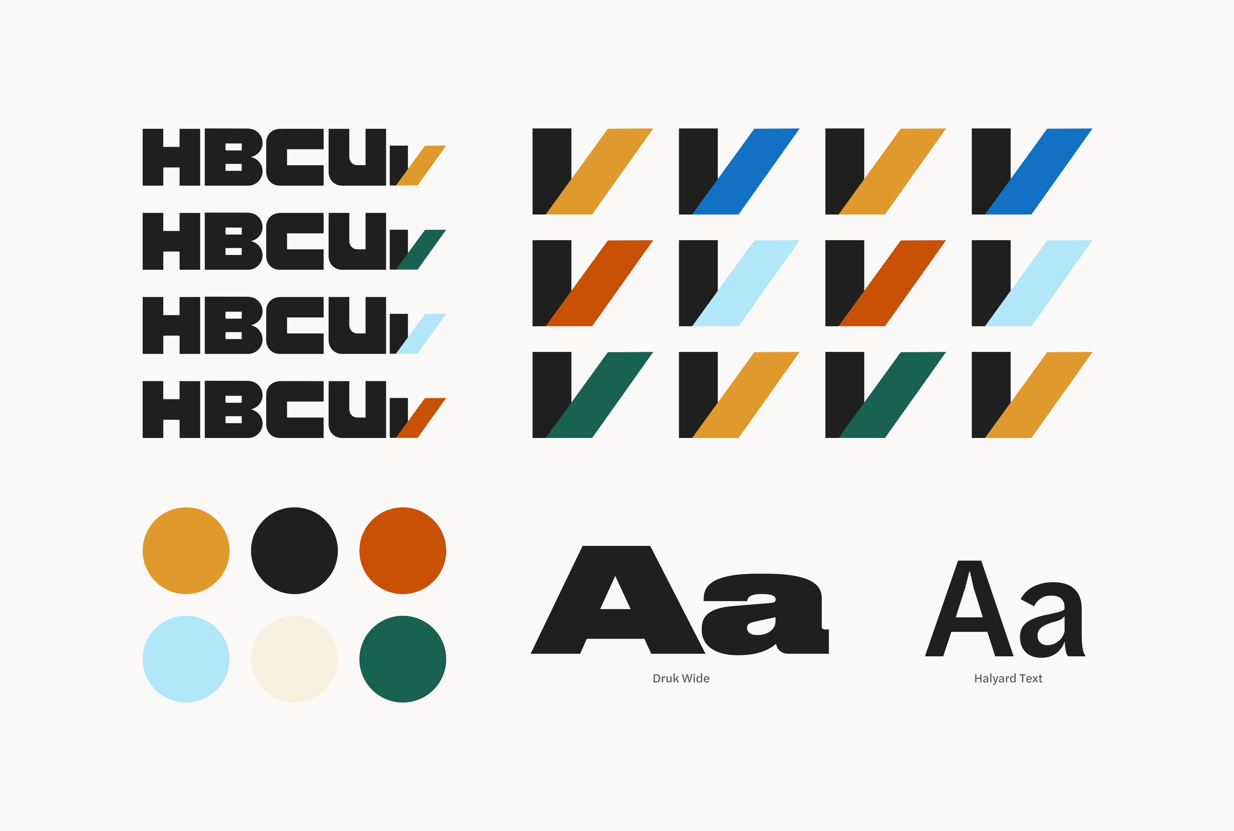
LOGO
Building a brand from scratch: a logomark, logotype, color and typography system was created which would inform the digital experience
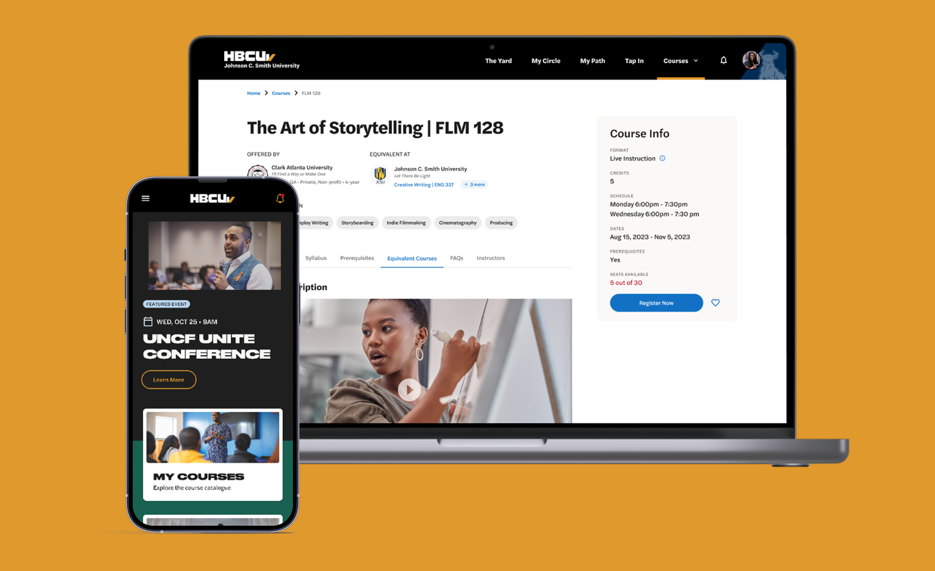
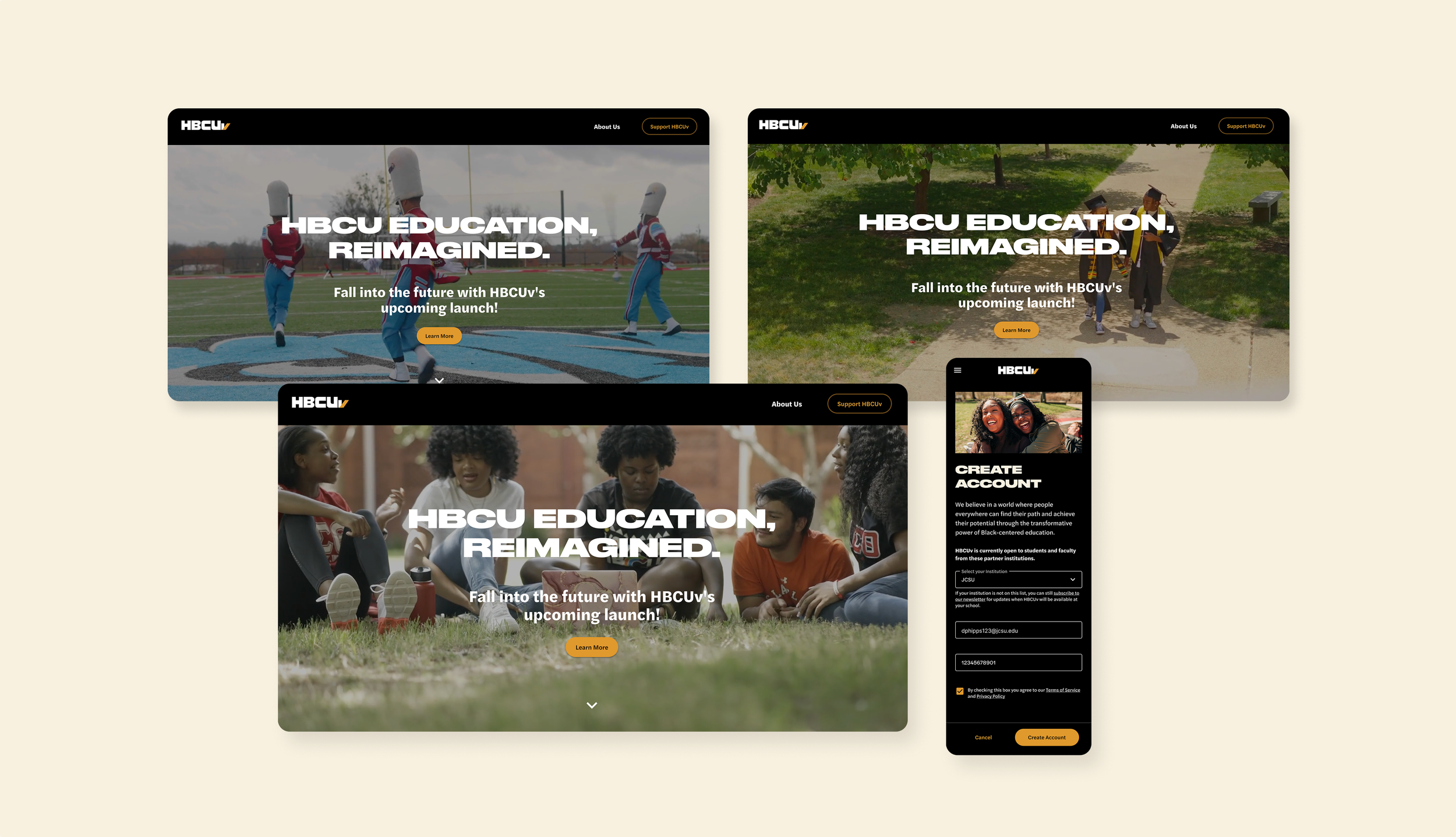
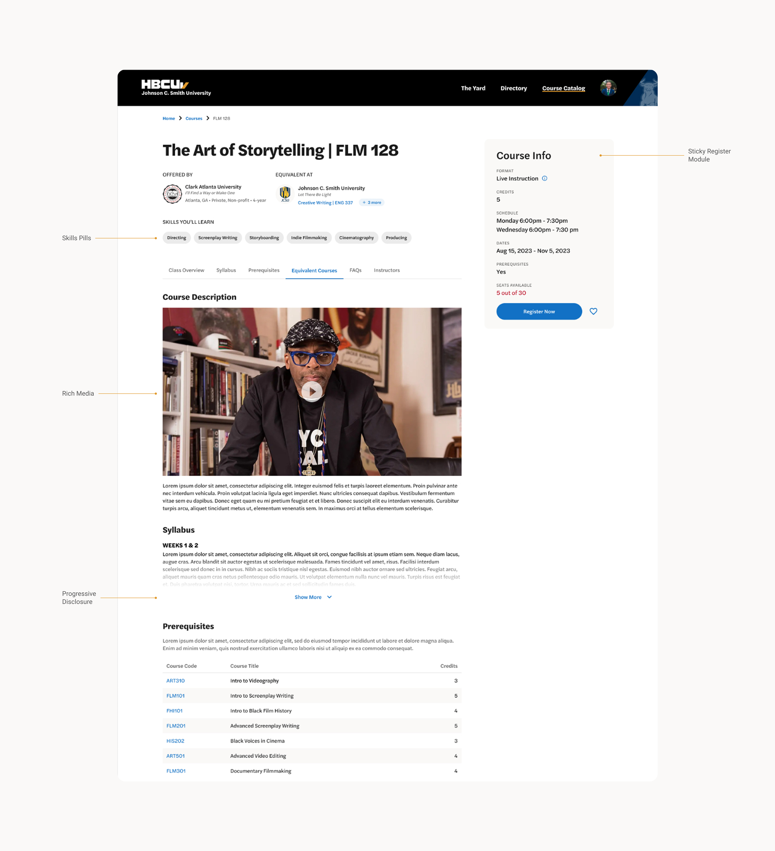
Landing Page & Sign-up
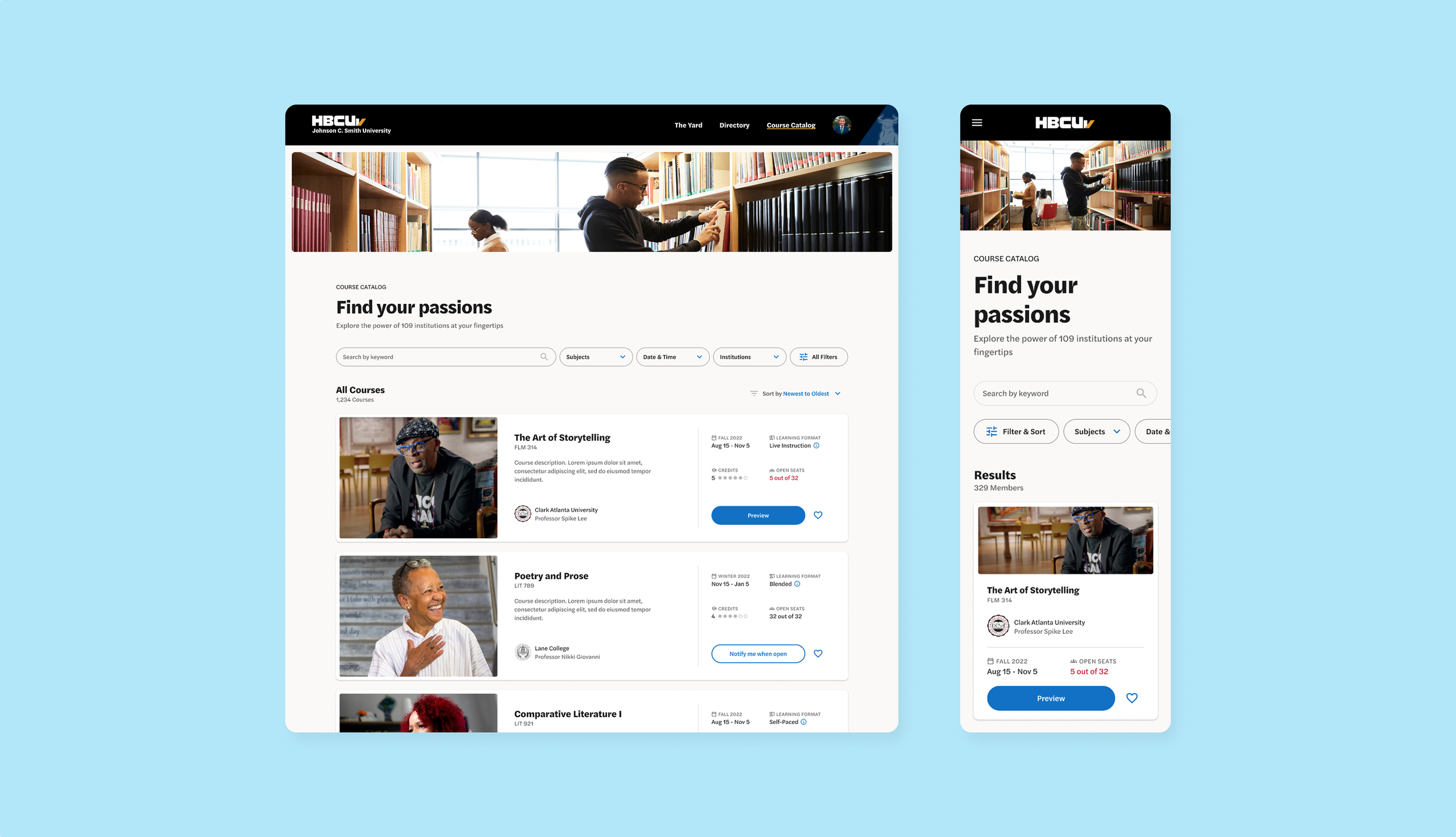
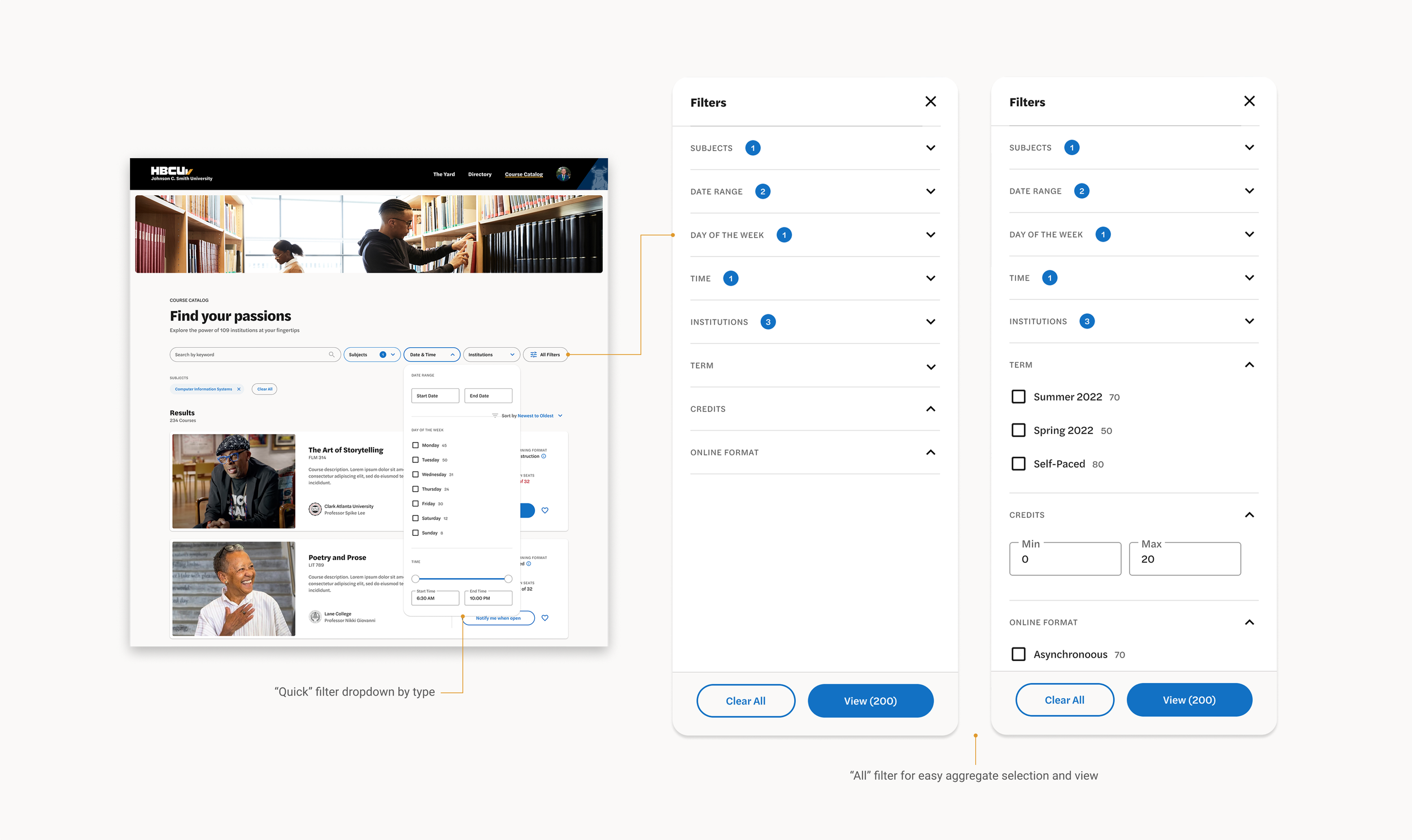
Course catalog with emphasis on the human aspect and Black faces
Robust course filter system by type and “All”
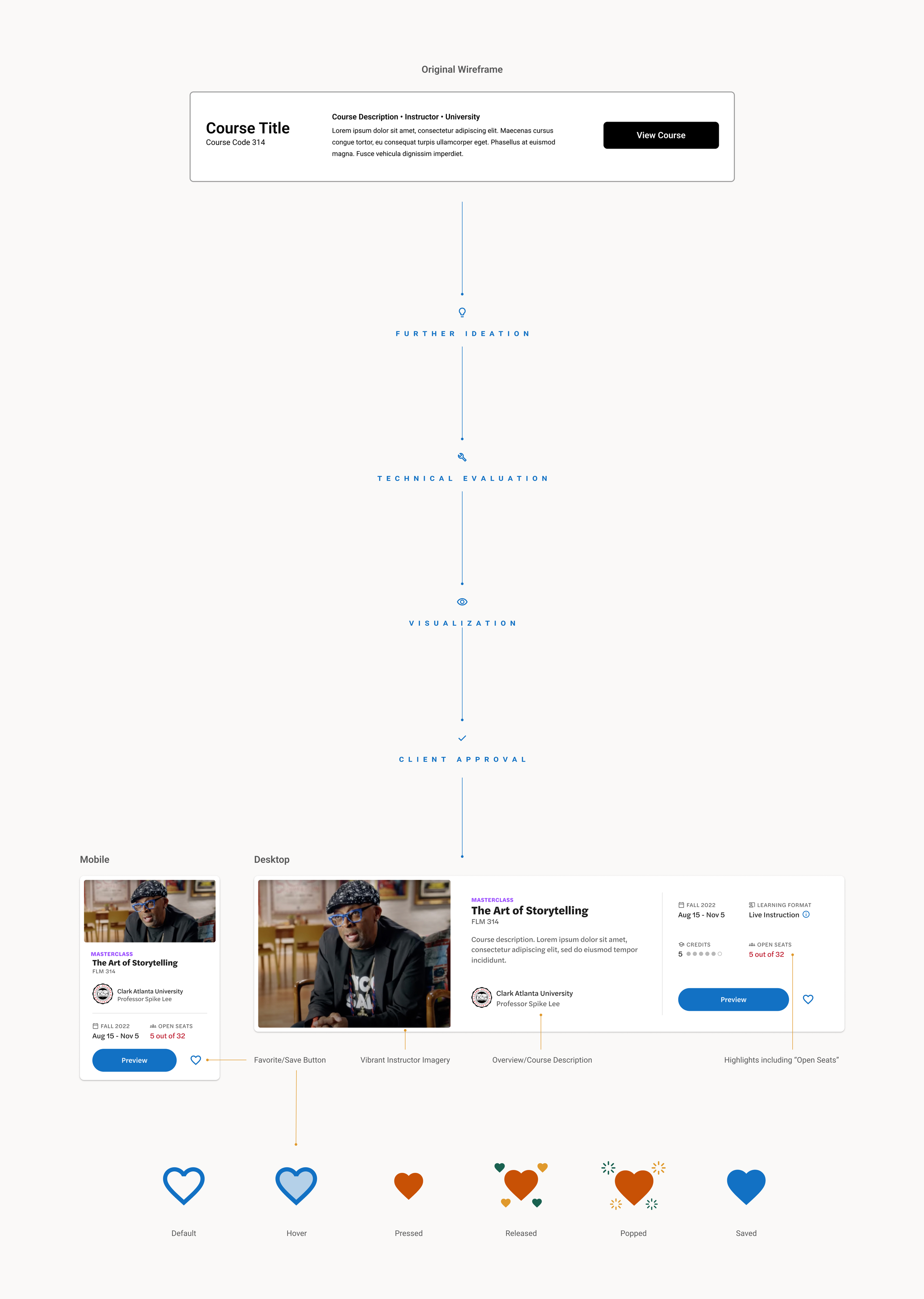
From Wires to Final Design
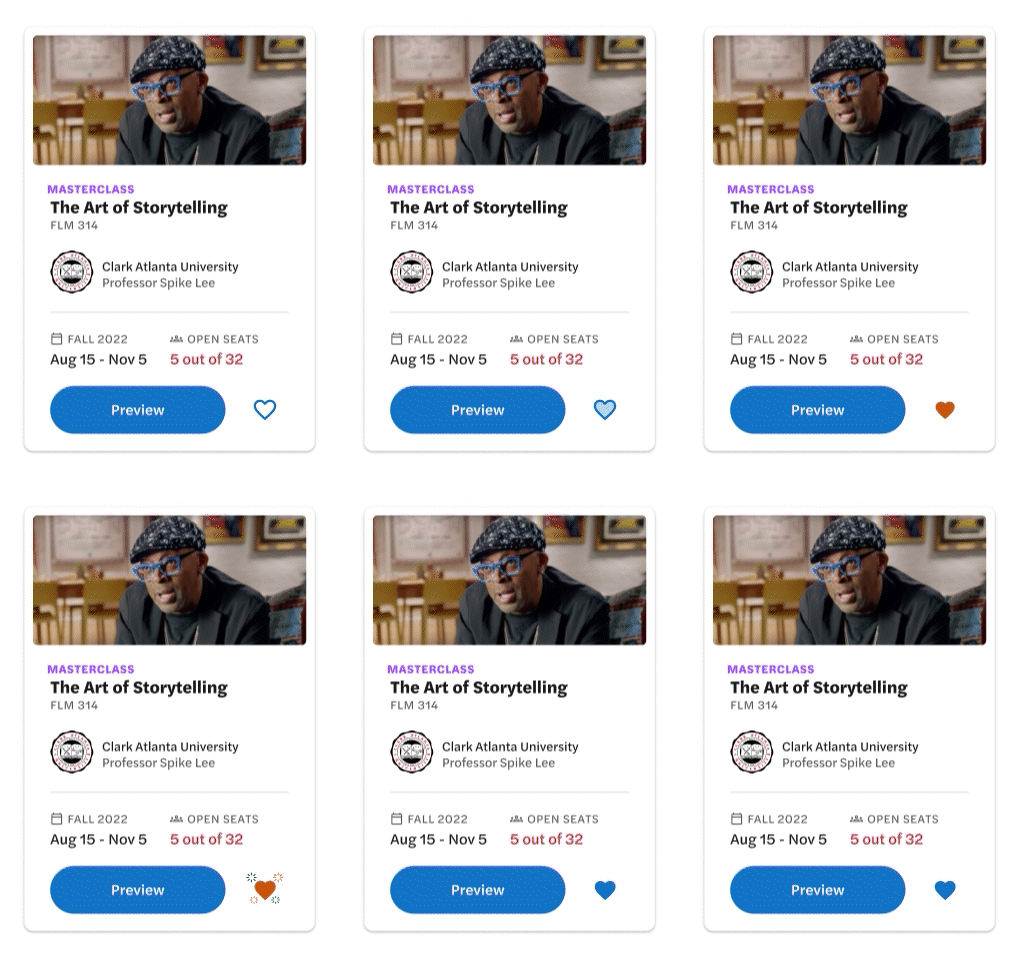
Course Card Anatomy
Objective.
Research.
Design.
CARD ANATOMY
Logistics
Whatever it is, the way you tell your story online can make all the difference.
Team MANAGEMENT
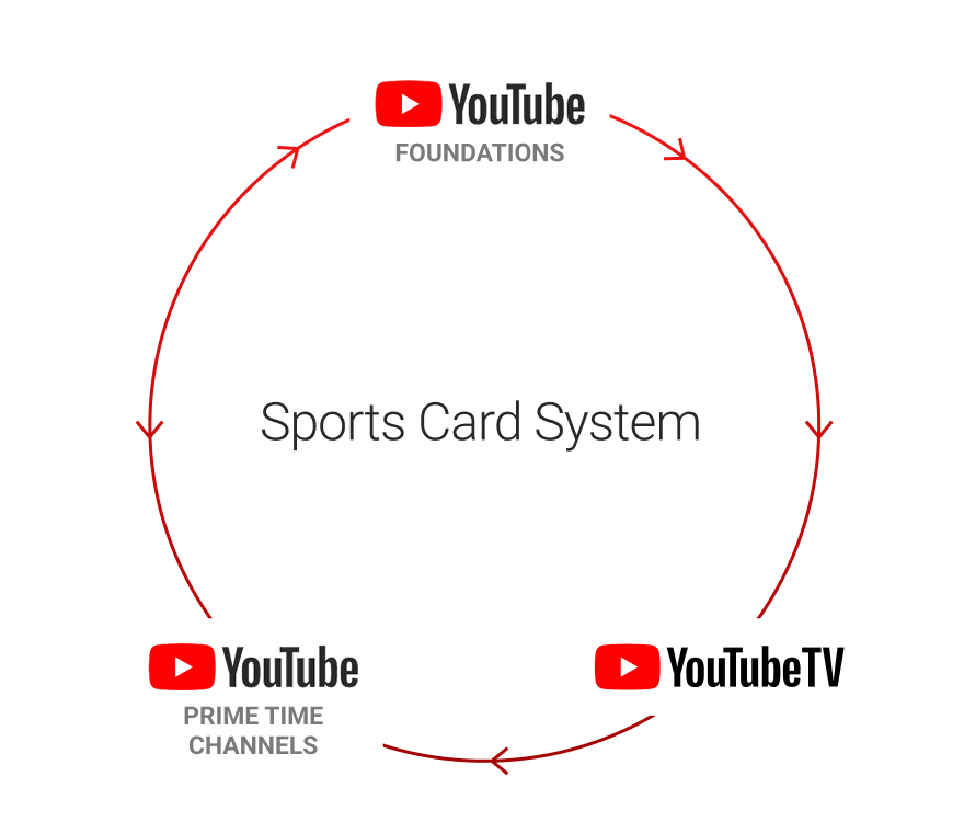
CROSS COLLABORATION
Whatever it is, the way you tell your story online can make all the difference.
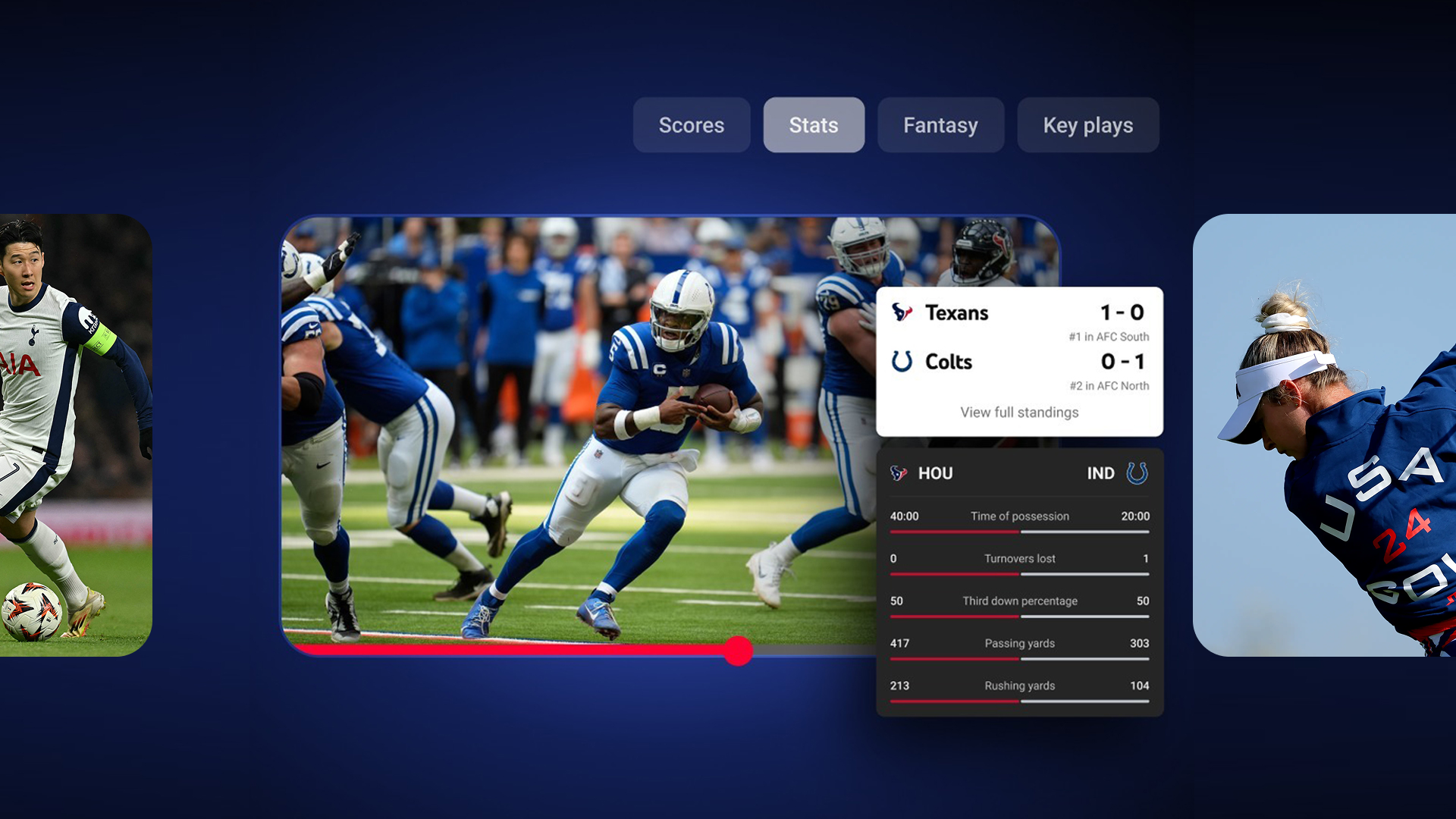
SCALING STAT CARDS
1. Player Highlight + Total Stats Card
Layout scales across all four sports. Lorem ipsum.
2. Current Score Card
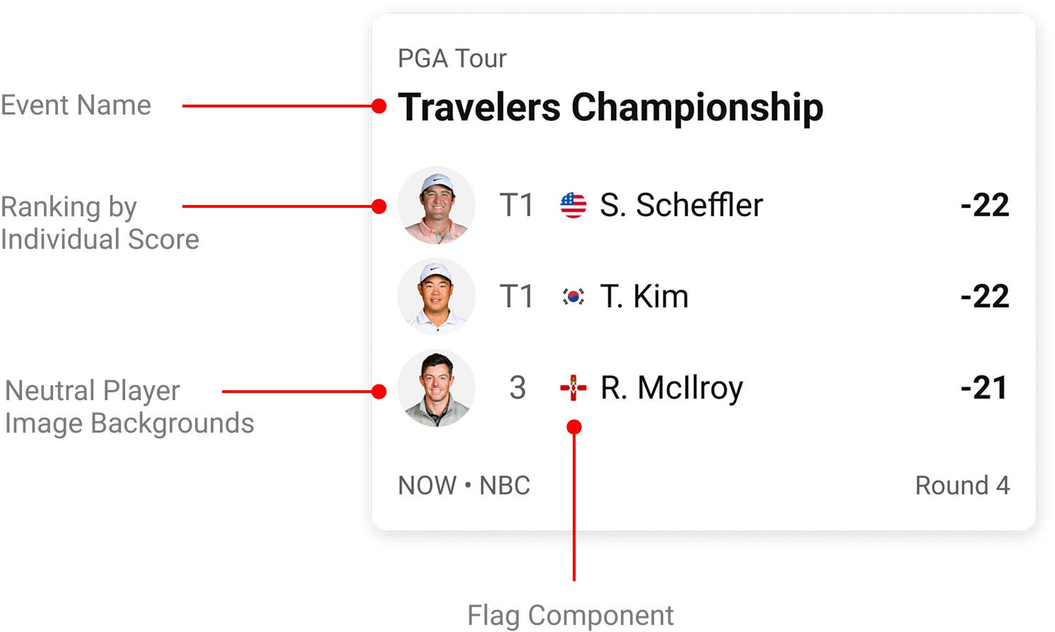
Layout scales across three sports except for golf. Golf being an individual player sport, research into golf stats, leaderboards, and ideation was required.
LEADERBOARD ANATOMY
Whatever it is, the way you tell your story online can make all the difference.
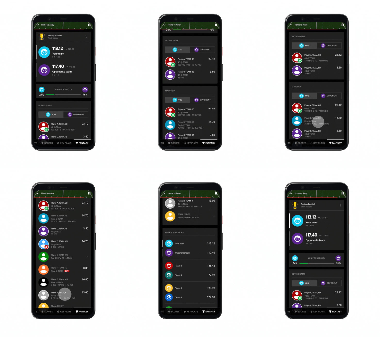
FANTASY FOOTBALL AND BEYOND
BAD Cropping
In some formats, key visual information had to be cropped out due to spatial limitations (the microphone in the above image and the heart in the bottom image), losing the original intent of the selected photograph.
DIfficult Legibility
Due to varying copy-lengths and the type being superimposed over photography, legibility was sometimes difficult.
Cropping issues in certain dimensions
Matrices
Variant Architecutre
Obscure/dark Imagery
When extending the imagery to full-bleed, not only did the same issue with cropping exist but a dark gradient was also needed to help make the copy legible. This dark look went against the brighter and cleaner direction we wanted to take visually.
Obscure imagery in previous display ads
Solution
new Grids
2x grid system.
Visual Hierarchy
Scaling elements according to importance.
Typography
Impactful and legible type with high contrast and use of negative space.
Image Ratios
Using standardized image ratios to reduce variability in different outputs.
PRoduction efficiency
Simpler, easier, and more robust for the production team to execute considering quality issues due to localization.
Anatomy of the display ad
Scalability for a global audience
For each quarterly centerpiece campaign, there could be anywhere between 18,000-20,000 total design pieces to output—much of this due to localizing copy for over 11 countries, languages, and currencies. After understanding all pain points and empathizing with members across teams such as brand, marketing, copy, translation, and production, I acted as the lead designer in designing Udemy’s new display ad formats. While achieving the new desired brand look, the scalability of these design systems vastly improved production efficiency, reduced time spent, and helped inform design in other channels such as automated social media ads.
OVER 100,000 Courses
The challenge of serving targeted ads on Facebook and Instagram was that Udemy offered over 100,000 courses—each with a corresponding course image which many times was user (or instructor)-generated and outside of the design team’s control. Creating a format that expressed a consistent brand look with unpredictable and divergent course imagery was a great challenge.
Design with SMARTLY.io™ AUTOMATION
We used an automation software called Smartly that would generate ads from these over 100,000 courses, pulling course titles and images from a server while also translating copy to localized languages. Finding opportunity to design an on-brand format that brought together these unpredictable variables was crucial.
IMPROVING ON PRevious designs
Before I started working at Udemy, the marketing and design team and gone through many iterations of design, testing for optimal results. My job was to take previous learnings, improve on design, and make it more consistent (color/typography) with our new visual direction with the key goal being to further improve performance.
New Format
ITERATING AND TESTING
Working with marketing—and considering the limitations of assets and the automation process, I created a design system with certain rules very similar to the affiliate display ads. Exploiting the capabilities of Smartly and the data sets that existed for each course, I included small “social proof” and “sale” badges of which their efficacy could be thoroughly tested with audiences.
RARE RESULTS
Key performance indicators greatly improved across-the-board in geos around the world. Efficiency increased on average 30% (the cost to acquire a new user decreased) which allowed us to scale spending 200-400% in key markets such as the US, India, and Brazil.
A COHESIVE LOOK ACross channels
While KPI’s greatly increased to the satisfaction of marketing and business as a whole, the brand team was happy to see that our design language across various channels began to finally take on a cohesive look.
